Kongbeng Cognitive Architecture — Interactive Systems Documentation
An interactive site explaining a multi-agent AI architecture mapped onto five brain regions — what each agent owns, what it is forbidden to decide, which models it runs, and how much VRAM it costs — with a data-flow simulator and a hardware comparison matrix.
- react
- tailwind css
- vite
- data visualization
- mermaid
- systems documentation
The problem
The AIOT Smart Office architecture has several agents whose responsibilities can easily bleed into one another, under VRAM constraints that must be considered at all times.
Explained as long Markdown, readers lose track of what connects to what — and worse, they cannot see what each part is forbidden to do. In a multi-agent system the boundaries you must not cross matter as much as the duties you must perform. When that is unclear, developers put decision logic in components that should never hold it, without noticing.
What I built
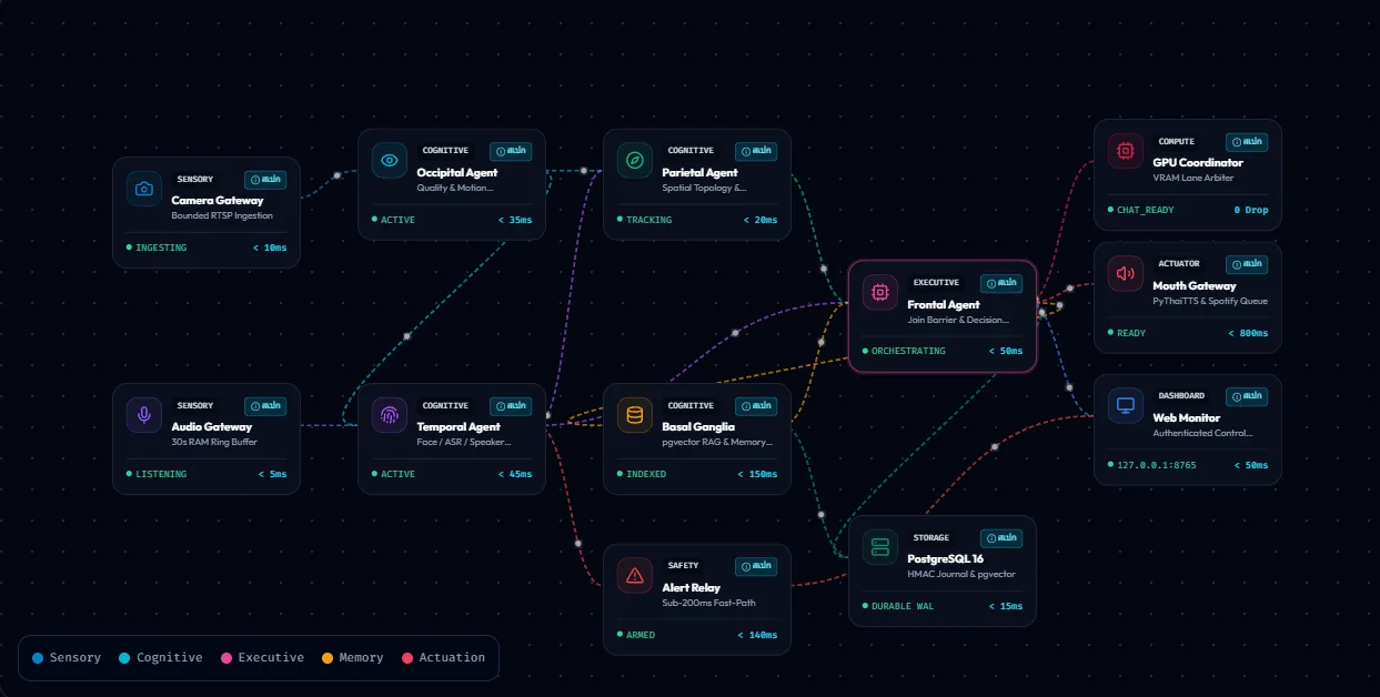
I turned the documentation into a site you explore by clicking, using five brain regions as the navigational frame — occipital sees, temporal hears, parietal locates, frontal decides — because people remember a meaningful structure far better than a list of module names.
The deliberate part: every agent shows its responsibilities and its prohibitions side by side. The visual preprocessing agent, for instance, is explicitly forbidden from deciding what an object means or who a person is, and from issuing any action at all. Putting the prohibitions next to the duties makes the boundary readable instead of inferred.
Architecture
Pure React + Vite, no backend. All content lives in separate JavaScript data modules — `brainRegions`, `contracts`, `graphTopology`, `hardwareMatrix`, `roadmapPhases`, `mermaidDiagrams` — so content changes never touch UI code.
Several views render the same dataset: an explorable brain visualiser, a linked node graph, a data-flow simulator, a cross-agent contract inspector, a hardware matrix that toggles between the 8 GB and 16 GB profiles, a roadmap view, a Mermaid renderer, and a command palette for jumping straight to a topic. About 4,200 lines in total.
My contribution
Written entirely by me — the data design, the information architecture, and the UI — as an extension of the AIOT Smart Office architecture I designed.
Challenges and trade-offs
Documentation that goes stale the moment it ships. The classic architecture-doc problem. I reduced the cost by separating data from UI completely: edit one data file and every view updates, with no parallel copies to keep in sync.
Too much information for one screen. Each agent carries models, VRAM figures, a latency SLA, a cadence, responsibilities, and prohibitions. Showing all of it at once is unreadable. The landing view shows only the five regions; detail opens in a modal on click — an overview for people who want the shape, depth for people who want the specifics.
Result
Live at kongbeng-flow.vercel.app, explorable with nothing to install. It works as a shared reference when walking someone through the architecture, in far less time than opening Markdown files one by one, and it opens on a phone mid-meeting.